Blog
This document provides an overview of the blog components available in your project. Each component has a small description, usage example, tips, and a screenshot.
Blog1 Component
Description
The Blog1 component is used to display a blog post with a title, content, and author information. It's designed to be simple and responsive.
Importing the Component
import Blog1 from "@/components/Blog/Blog1";
Tips
- Ensure the content passed to the
Blog1component is properly sanitized to avoid XSS attacks. - Use the
Blog1component within a responsive grid to maintain layout integrity on different screen sizes.
Screenshot
Blog2 Component
Description
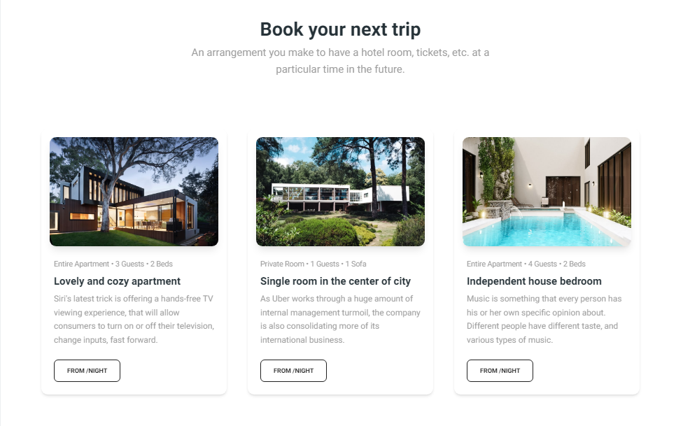
The Blog2 component is designed to display multiple blog entries in a card-based layout. Each card includes an image, title, description, and key details like room type and capacity. This component is ideal for showcasing a list of blog posts or articles, making it easy for users to browse through different entries visually. The layout is responsive and ensures a consistent appearance across various devices.
Importing the Component
import Blog2 from "@/components/Blog/Blog2";
Tips
- Utilize the tags feature to improve blog post discoverability through filters.
- Ensure that the comments section is secure and moderated to prevent spam.
Screenshot