Hero Sections
This document provides an overview of the hero section components available in your project. Each component has a small description, usage example, tips, and a screenshot.
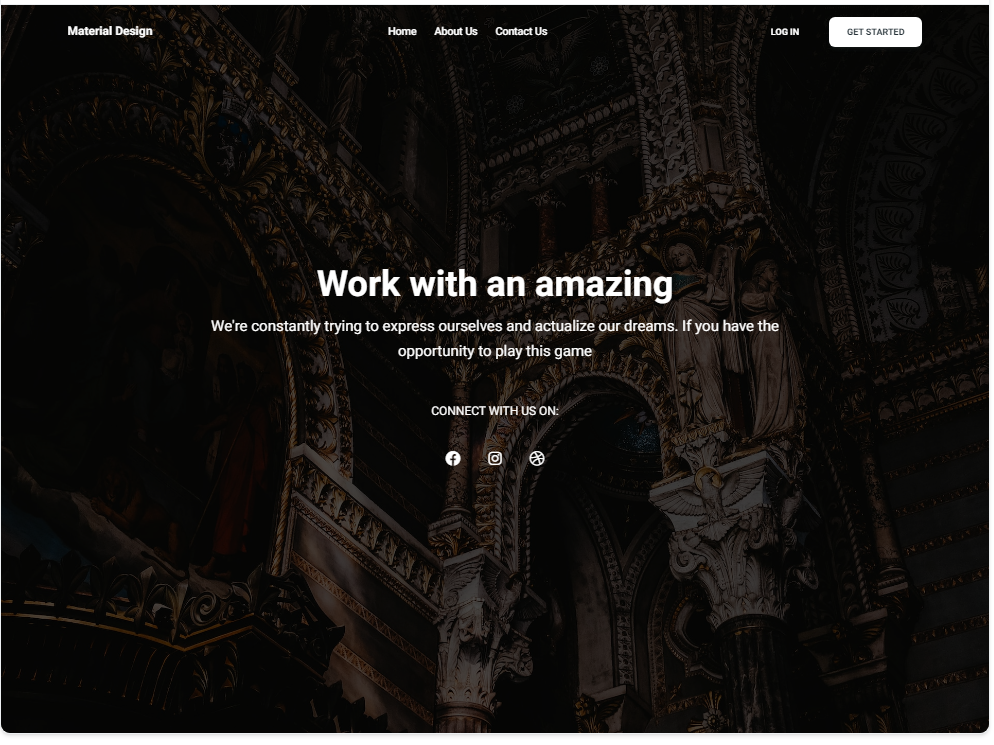
HeroSection1 Component
Description
The HeroSection1 component is a full-width hero section designed to make a strong visual impact. It includes a background image, a main headline, a subheadline, and social media icons for additional engagement.
Importing the Component
import HeroSection1 from "@/components/HeroSections/HeroSection1";
Tips
- Use high-quality images for the background to ensure a visually appealing hero section.
- Customize the headline and subheadline to convey your key message effectively.
Screenshot
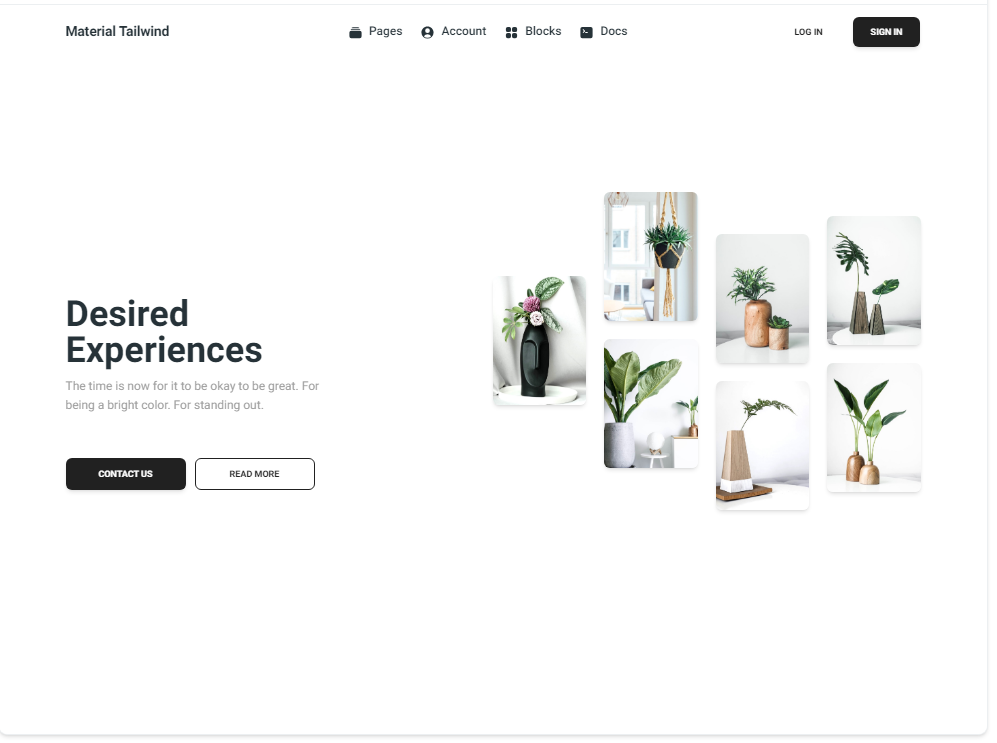
HeroSection2 Component
Description
The HeroSection2 component offers a clean and minimalistic hero section layout. It includes a main headline, a subheadline, call-to-action buttons, and an image gallery to showcase your content effectively.
Importing the Component
import HeroSection2 from "@/components/HeroSections/HeroSection2";
Tips
- Use the image gallery to highlight key products or services.
- Ensure that the call-to-action buttons are prominent and guide the user to the next steps.
Screenshot