Cards
This document provides an overview of the card components available in your project. Each component has a small description, usage example, tips, and a screenshot.
Card1 Component
Description
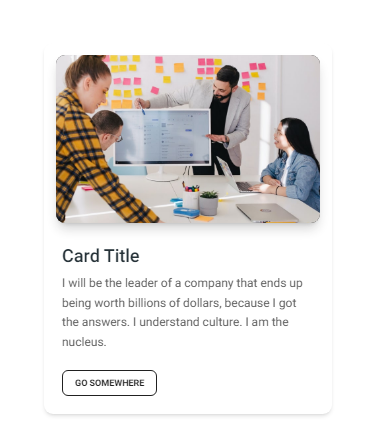
The Card1 component is a basic card layout ideal for displaying brief information, such as user profiles or product highlights. It includes an image, a title, a short description, and a call-to-action button.
Importing the Component
import Card1 from "@/components/Cards/Card1";
Tips
- Use consistent dimensions for cards to maintain uniformity across your layout.
- Customize the card's content and style through props to match your design system.
Screenshot

Card2 Component
Description
The Card2 component offers a more detailed card layout without an image, including sections for titles, descriptions, and action buttons. This layout is suitable for listing articles, products, or services in a concise format.
Importing the Component
import Card2 from "@/components/Cards/Card2";
Tips
- Ensure that the descriptions are brief but informative to keep the user engaged.
- Leverage the action buttons to drive user engagement through calls to action.
Screenshot
