Contact
This document provides an overview of the contact components available in your project. Each component has a small description, usage example, tips, and a screenshot.
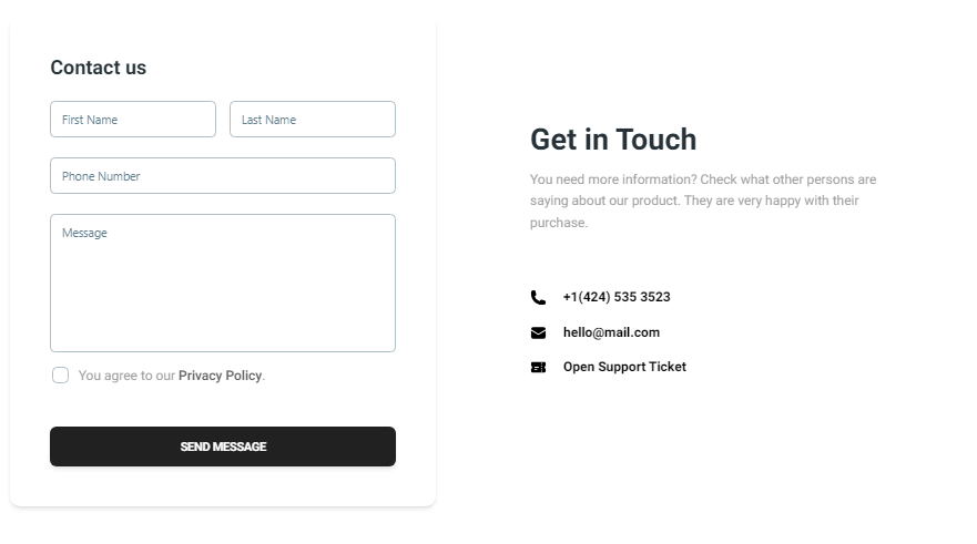
Contact1 Component
Description
The Contact1 component is designed for a basic contact form that includes fields for the user's first name, last name, phone number, and message. It also provides a section to display contact information such as phone number, email, and support ticket link.
Importing the Component
import Contact1 from "@/components/Contact/Contact1";
Tips
- Ensure the form validation is in place to capture accurate user information.
- Customize the contact information section to reflect your actual support details.
Screenshot
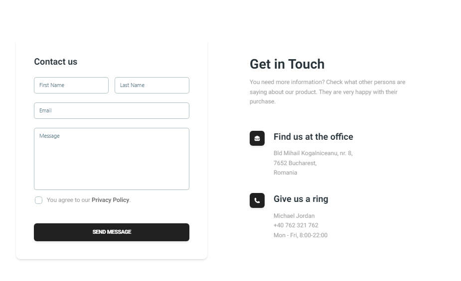
Contact2 Component
Description
The Contact2 component provides an extended contact form with fields for the user's first name, last name, email, and message. It also includes a detailed section for contact information such as office address and phone number, enhanced with icons for better visual representation.
Importing the Component
import Contact2 from "@/components/Contact/Contact2";
Tips
- Ensure the form includes proper error handling and validation for the email field.
- Use the contact information section to provide clear and accessible ways for users to reach you.
Screenshot